A little space
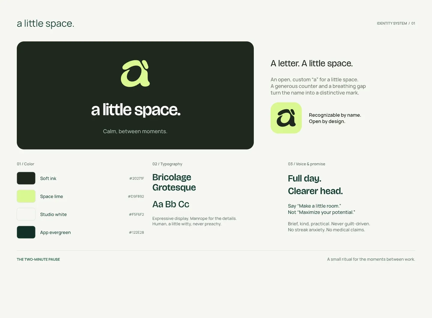
Calm, between moments. A brand and digital experience for short guided resets that fit into the spaces of a busy working day.
The challenge.
Give a wellbeing product a calm, recognisable identity and make a two-minute pause feel approachable within an already full day.
The direction.
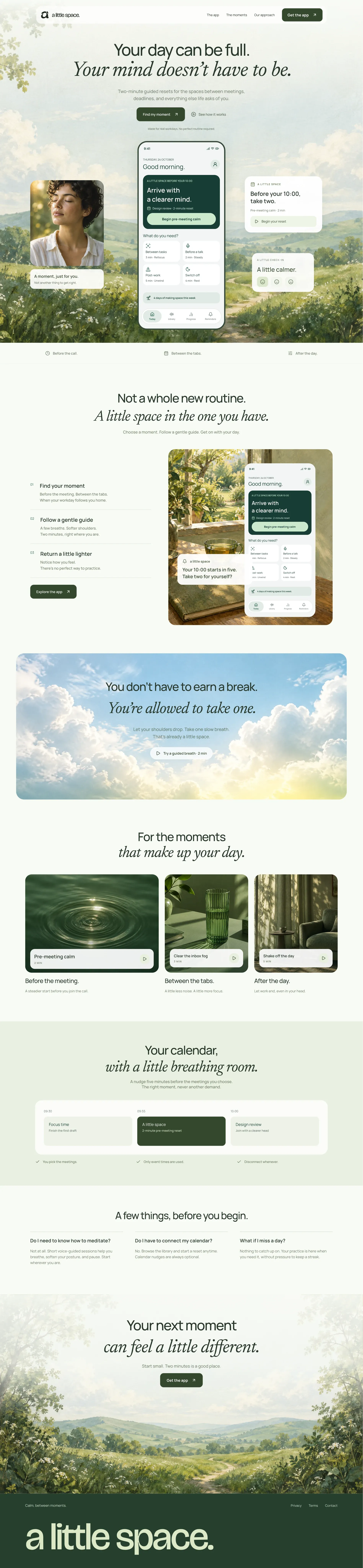
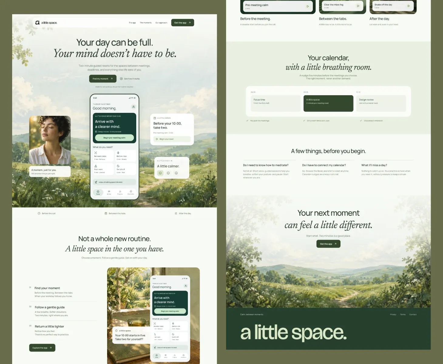
Connect an open, custom lettermark with a palette of soft ink, lime and evergreen. Pair expressive typography with a garden-inspired website, clear app previews and responsive layouts that guide people towards a moment of calm.
What shipped.
A connected brand identity and desktop and mobile website designs, with product screens showing guided resets, calendar moments and gentle check-ins.
THE DETAILS
A closer look.